We all know that cover’s do, quite indeed matter! Maybe not so much in the end with huge, international bestsellers like Divergent because the reputation alone probably inspires purchase. But at some point this book was relatively unknown, sitting on a shelf, begging to be read! Which of these cover’s do you think would have jumped out at you most if you hadn’t heard of the book?
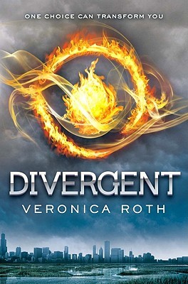
First up, we have the cover we all know- The U.S version. If you’ve ever wondered if there was meaning behind the cover, check out this post by Veronica Roth, where she explains the cover choice! My personal thoughts: A few week’s ago Kathryn did a post on ambiguous covers- I definitely think Divergent falls into that category. You really don’t get a clue from the cover what this story is about. That doesn’t mean I don’t like it. I do in fact. And apparently so did almost every other person in charge of choosing foreign covers- Out of 115 editions listed on Goodreads, there is very little variation. That is actually pretty unusual. Anyway, we’ve put together a collection of the most different foreign covers and other editions that we found. Here we go!
Like I said, there are 115 different editions of this book, most of which are too similar to the U.S cover to mention. However, the U.K Cover is strikingly different. Sure, this cover is less ambiguous than the U.S, but I’m pretty sure if I had seen this on the shelf, I would have thought the story was some sort of mythical Native American story. I guess that might not be the case in Great Britain, but I’m still not sure if I prefer this cover over the original. I also find it to be a bit too girly for this story.
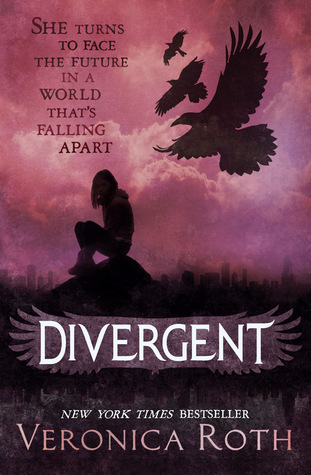
Late last year (2013), Harper Collins released a Special Adult Edition of Divergent, featuring a cover they thought would appeal more to an older crowd. Divergent definitely falls into the cross-over category and I know more adults who have read the series than I do teens. I like this cover- I’m not sure if I do any more than the original but I could see adults, men especially, feeling less weird about buying a book with this cover! It does remind me a bit of the Hunger Games Cover, and I’m not sure why, maybe it’s the colors? Regardless, this book wouldn’t have necessarily jumped off the shelves at me either.
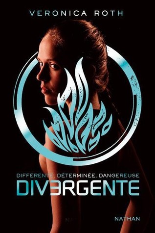
The French Cover features a model with the same symbol as the original cover. I really don’t like this cover. I’m never a big fan of models on book covers because I like to use my imagination to decide what a character looks like. But mostly I don’t like this cover because it looks really cheap. I would have definitely passed on this one if I had run across it in a book store.
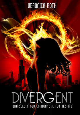
Hmm, this Italian Cover definitely pops. It certainly would have caught my eye at the bookstore, but the image on the cover confuses me- it’s either too sexy or looks like the girl is about to change into something supernatural. On a positive note, I think out of all the covers, I like this city sky line best.
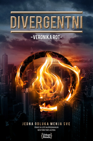
I really like the Serbian cover! The colors are perfect for the tone of the story and seem more interesting to me than the original. I also like that you can see Chicago here!
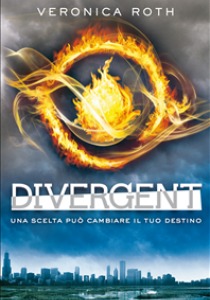
The only big difference in this Italian ebook version is the white behind the title. I actually think it takes away from the cover.
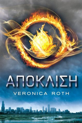
Not alot of big differences going on here with the Greek cover either. I mostly included it because I like the Greek letters lol, but it does seem like the clouds up top are a bit darker than the original version, which I think works for this story!
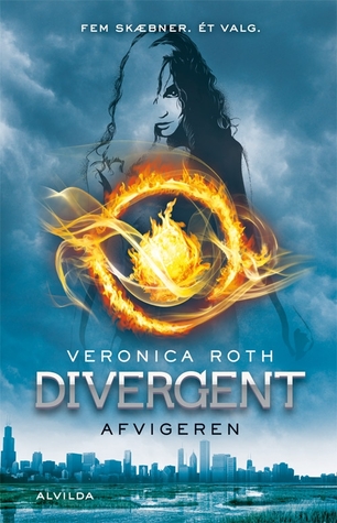
This Danish version is basically the same as the originally expect for the outline of a girl in the background. I’m not sure why, but I like this one alot! I think it makes the cover much more interesting!
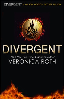
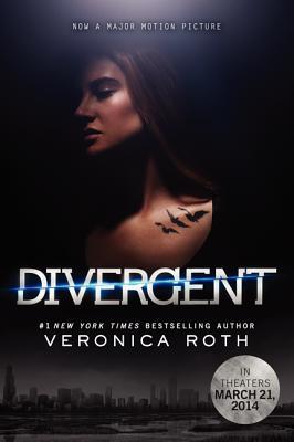
Here we have the paperback, Film Tie-In version. I’ve never, ever been a fan of movie posters as book covers- I actually quite hate them. I would never buy one with the actors and actresses on the cover and have actually gone out of my way in the past to find books with original artwork on them.

Here’s another cover with the Movie tie-in. Like I said before, I always hate these, but I hate this one even more than the last lol. Gross.
The German Cover just seems to use different hues than the original cover. So not much to discuss here, but I like this one less than I like the Greek cover, which appears to have used the same tactic.

And that’s all folks! I think after looking at all of these, my favorite is either the Danish or the Serbian cover. I actually like them more than the original. What about you? Which is your favorite? Have you seen any other editions that we don’t have here?


I just started reading this book, and I’m not impressed, so I hope it gets better.
That aside, I don’t hate the cover, but I do like that “adult” cover better. I also like the (Danish) cover with the outline of a girl in the skyline. And, I like the (French) one with the model and the the blue symbol. But, I don’t really care for the really dark movie cover they use now.
I like Divergent so much. Covers dont matter, story does. But I like the second one. I have the first one.