Cover Counts! October edition!

‘Tis that time of the season! Leaves are falling, wind is blowing and with a bit of exaggeration, the fireplaces are being lit. It’ s a perfect time to read! Plus, since we have about 3 months left in 2014, I feel like I have just enough time to catch up on my reading goal. (which, according to my Goodreads, I’m behind 4 books! Yikes!)

Here are some great books for you guys to look at!


*It’s here! The fifth and the final book to the Rick Riordan’s “The Heroes of Olympus” series. Although I’ve never been able to get into this book, people everywhere have highly anticipated the release of this book. So far, one day after its release, it has awesome reviews! So for those people who doesn’t like waiting for years for a conclusion, here is your chance to start this seemingly adventurous and epic series!

*Does any of you watch “Witches of East End?” Tiffany and I are suckers for supernatural tv shows and we stumbled into it because it was on Netflix. It turns out to be a very descent show! It kinda reminded me of “Charmed” a little bit but this has better CG, better story, and better looking people. So it is no surprise that I would love this book! and why not you? And if the witch part doesn’t convince you, the part about where she is thrust into the world of witches, ghosts, pirates, and all-too-handsome-healers might change your mind.


*Sometimes it’s inspiring to read about 12-15 year old kid’s crazy and out of the world adventures. The choices he/she has to make at such a young age makes me think about the not-so-great choices I’ve made but then I remember that it is written by a grown person and I let go of my guilt. ;-P This first book of the series “Summoner” tells a story about an apprentice blacksmith who discovers a hidden ability to summon demons from another world. Then he gets thrown into an academy of powerful nobles to train to fight a war against orcs with only his demon Ignatius for help. (reminds you a little of Bartimaeus series, anyone?)


*Putting an end to another series, “The Agency - Rivals in the city” is a Victorian woman detective novel originally published in the UK. In this fourth and last book, Mary Quinn, an independent minded woman for its time period, tires to solve a dangerous case while she hesitates the proposal from her long term love interest James Easton. It is described to be a well researched, action packed book and a perfect replacement for those who loves “Sally Lockhart” series. Here is an awesome article about how the book cover was made! Honestly, I thought it was CG but it is not! Click Here


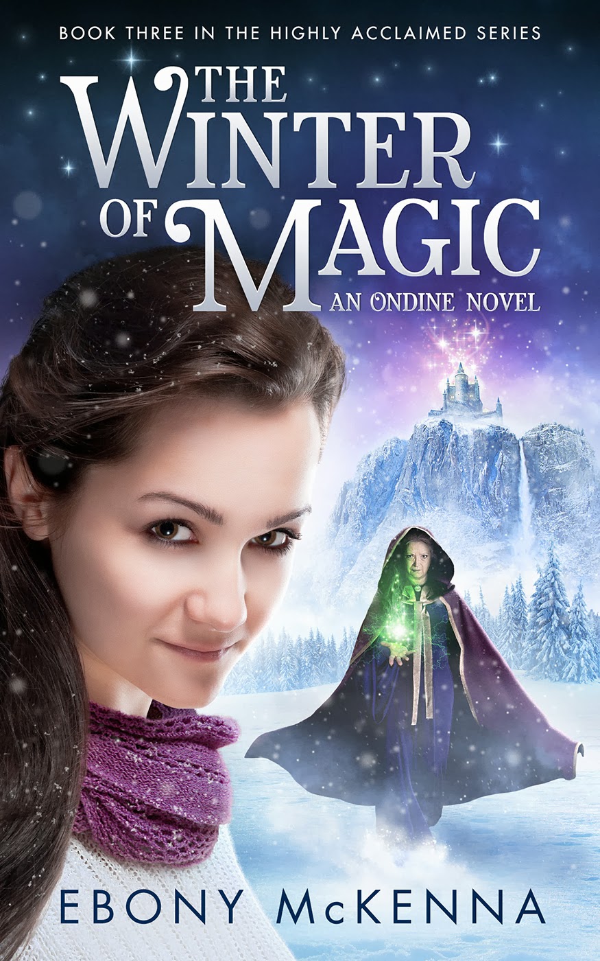
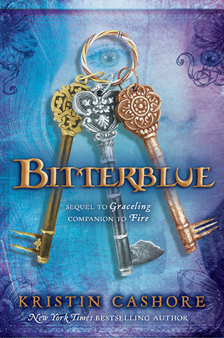
*Summer is gone, but why should we put reading about mermaids, river witches, and sea dragons on hold?!! I was already sold with the description about them! And this amazingly beautiful cover helps a lot with the decision making. =D Enough said!

Covers Count! Divergent Covers- Foreign and Special Edition Cover Comparison!

We all know that cover’s do, quite indeed matter! Maybe not so much in the end with huge, international bestsellers like Divergent because the reputation alone probably inspires purchase. But at some point this book was relatively unknown, sitting on a shelf, begging to be read! Which of these cover’s do you think would have jumped out at you most if you hadn’t heard of the book?

Covers Count

First up, we have the cover we all know- The U.S version. If you’ve ever wondered if there was meaning behind the cover, check out this post by Veronica Roth, where she explains the cover choice! My personal thoughts: A few week’s ago Kathryn did a post on ambiguous covers- I definitely think Divergent falls into that category. You really don’t get a clue from the cover what this story is about. That doesn’t mean I don’t like it. I do in fact. And apparently so did almost every other person in charge of choosing foreign covers- Out of 115 editions listed on Goodreads, there is very little variation. That is actually pretty unusual. Anyway, we’ve put together a collection of the most different foreign covers and other editions that we found. Here we go!

8306857

Like I said, there are 115 different editions of this book, most of which are too similar to the U.S cover to mention. However, the U.K Cover is strikingly different. Sure, this cover is less ambiguous than the U.S, but I’m pretty sure if I had seen this on the shelf, I would have thought the story was some sort of mythical Native American story. I guess that might not be the case in Great Britain, but I’m still not sure if I prefer this cover over the original. I also find it to be a bit too girly for this story.

13335038

Late last year (2013), Harper Collins released a Special Adult Edition of Divergent, featuring a cover they thought would appeal more to an older crowd. Divergent definitely falls into the cross-over category and I know more adults who have read the series than I do teens. I like this cover- I’m not sure if I do any more than the original but I could see adults, men especially, feeling less weird about buying a book with this cover! It does remind me a bit of the Hunger Games Cover, and I’m not sure why, maybe it’s the colors? Regardless, this book wouldn’t have necessarily jumped off the shelves at me either.

18517479

The French Cover features a model with the same symbol as the original cover. I really don’t like this cover. I’m never a big fan of models on book covers because I like to use my imagination to decide what a character looks like. But mostly I don’t like this cover because it looks really cheap. I would have definitely passed on this one if I had run across it in a book store.

16136701

Hmm, this Italian Cover definitely pops. It certainly would have caught my eye at the bookstore, but the image on the cover confuses me- it’s either too sexy or looks like the girl is about to change into something supernatural. On a positive note, I think out of all the covers, I like this city sky line best.

18523885

I really like the Serbian cover! The colors are perfect for the tone of the story and seem more interesting to me than the original. I also like that you can see Chicago here!

17970762

The only big difference in this Italian ebook version is the white behind the title. I actually think it takes away from the cover.

13601883

Not alot of big differences going on here with the Greek cover either. I mostly included it because I like the Greek letters lol, but it does seem like the clouds up top are a bit darker than the original version, which I think works for this story!

15836164

This Danish version is basically the same as the originally expect for the outline of a girl in the background. I’m not sure why, but I like this one alot! I think it makes the cover much more interesting!

13560379

Here we have the paperback, Film Tie-In version. I’ve never, ever been a fan of movie posters as book covers- I actually quite hate them. I would never buy one with the actors and actresses on the cover and have actually gone out of my way in the past to find books with original artwork on them.

19539657

Here’s another cover with the Movie tie-in. Like I said before, I always hate these, but I hate this one even more than the last lol. Gross.

18085525

The German Cover just seems to use different hues than the original cover. So not much to discuss here, but I like this one less than I like the Greek cover, which appears to have used the same tactic.

13131651

And that’s all folks! I think after looking at all of these, my favorite is either the Danish or the Serbian cover. I actually like them more than the original. What about you? Which is your favorite? Have you seen any other editions that we don’t have here?

Ambiguous Covers - Dare You to Find a Meaning

A cover of a book can often give us a sense of direction of its contents. It is no mystery that a book about a dragon has a dragon on the cover or for a Young Adult genre, a beautiful girl or a boy. Sometimes it expertly captures a moment from the pages like the Harry Potter series. But what if they don’t tell you anything? What are some of the most misleading book covers you have seen? Here are some of mine.

Twilight

twilight saga

Yes, this book was a phenomenon. But what is up with the covers? Did anyone know that a pair of pale hands holding a red apple meant it was going to tell a story of a vegetarian Vampire falling in love with an awkward human girl? It did not get better with book 2, 3, or 4. A “flower” for New Moon, “ribbon” for Eclipse, and “Chessboard” for Breaking Dawn? It’s as if no thought was put into this.


The Body Finder

body finder series

Another example that is quite similar, yet a very fine read- “The Body Finder” series. I am not going to lie, I picked up this book at a book store simply because of its cover. It looked beautiful, mysterious and enchanting. Frankly, it looked more to be in the genre of Science Fiction. But of course, this book is about a girl who can sense the dead from a very young age. I’ve only read the first two and I will eventually read the rest but from where I left off, she was getting involved with the police because of her ability to find deceased people. It is refreshing for a young adult fiction and the romance is quite mature and real.


Author Ellen Hopkin’s books (Impulse and Crank series)

ellen hopkins

What can I say, these book covers feel like a work of art. Each one of them screams out loud to be noticed and heard! Personally, I haven’t read any of her books since all of them seem a little depressing and too real for my taste, but most of her books are on the New York Times bestsellers list and with high recommendation from most people who have read them- I should really give her a try. Powerful covers!


Author Amelie Nothomb

mmm

Undoubtedly one of my favorite French authors. She is witty, creative, a bit scary and so FRENCH! By the way, this is her, the author on the cover, which she does for most of her books! I have yet to find another author who does this and would love it if somebody could give me other examples of such a brilliant and brave person! Unfortunately, the body language she uses on the covers don’t say much about the title nor the contents of her books. Regardless, this makes me feel like she must be a very approachable author. =)

Various

ambiguous

There are so many books out there with “ambiguous” covers. But as I was going through my bookshelf I realized, having read most of these, I didn’t really care if the title matched the covers or not. Mostly you don’t think about it afterwards- but I do like covers that are powerful, colorful and outstanding! After a while of going through my list of books to find these examples, I felt a little deceived.

We’d love to hear your opinion about a book cover that you loved but didn’t necessarily match the story! Or anything that you think it is worth adding at the end of this list! =)

Cover Reveal- Deborah Harkness, Ridley Pearson and More! Don’t Miss these Awesome Covers!

Here we have it! The cover for the third and final book of the “All Souls Trilogy” has been revealed! Unfortunately, fans of the book will have to wait until July to read it. The first book, “A Discovery of Witches” has been on my highly anticipated list for some time now but to be honest, I never found the covers to be all that catchy. Nevertheless, here is the cover that we’ve all been waiting for!

Harkness_BookOfLife

Expected Publication: July 15th 2014


Another third installment of a promising series “Ondine”, “The Winter of Magic.” The story is about a girl who has found love within a pet ferret called “Shambles.” But the ferret is actually a boy cursed by a witch who happens to be related to the girl. When Shambles is turned back into a boy temporarily, the girl vows to break the spell and turn him back to a boy. Honestly, I am quite intrigued by this story. Plus the titles, “Summer of Shambles”, “Autumn Palace” and “Winter of Magic”. How lovely!

Ondine 3 - The Winter of Magic cover v9e - high res max 10

No expected publication date yet for US version

The next book is none other than Ridley Pearson’s 7th and final book of the “Kingdom Keepers” series. The books in this highly acclaimed Middle Grade series always come complete with covers that promise action and adventure! And without any disappointment, the cover of “The Insider” is just simply spectacular! Love it! Go Disney!

18296022

Expected Publication: April 1st 2014

Finally, I left my favorite for last. The author is one that I have not heard of but after one look at this cover, I was mesmerized. “Fractured Steel” is about a woman named Karen Barnes who survived a bloody tour in Iraq. When she returns, there is nothing more she wants than a peaceful life surrounded by horses and mountains. But all is threatened when a stranger tries boarding a horse worth millions at her stable. Stunning cover indeed.

20453850

Expected Publication: February 15th 2014

Which cover makes YOU most want to read the book?

Let us know!

Cover reveals of this month

Even with weather being stuffy, hot and rainy, we are getting more and more excited everyday with Book Expo America 2013 only a week away! Tiffany has been going there for years but as for me, it will be my first visit. I don’t have to tell you, as fellow book lovers yourselves, just how much this excites me! But before we get to the good stuff about authors and books we meet at BEA, here are some great YA book covers that were revealed recently. Enjoy!

I think it is safe to say that Tiffany and I are both very excited about the new cover of “Allegiant,” the third and THE FINAL book of the Divergent series. We are also excited that Veronica Roth is coming to Book Expo America 2013, Friday, May 31 for one of the event that is called “Author’s Breakfasts.” And we have the tickets to see her in person! Who knows? She might be giving out signed copies of Allegiant!

Allegiant: Expected publication October 22, 2013

I am very excited to announce Simone Elkeles’s new book called “Wild Cards,” it is about a boy who lives with his stepmother while his father is deployed. He cannot wait the day he gets to live on his own and to be involved in another family’s drama is last on his mind. Simone Elkeles is a master when it comes to laying out and solving dramas in chronological order. Although I am not too happy with the cover, the content should not be disappointing.

Wild Cards: Expected publication October 1, 2013


Another third and THE FINAL book to a series is Marie Lu’s Legend. I’ve read this book almost right after Divergent, which is why they both got jumbled in my head and disappeared altogether from my memories. But the cover as always, is quite catching!


Champion: Expected publication November 5, 2013


Sophie Jordan’s new series “Uninvited,” not only has a stunning cover but also has a very intriguing story! It’s about a girl who lives in a society/world where people are defined by their genes. And Davy, (original yet weird just like all the names she used for Firelight series) is tested positive for Homicidal Tendency Syndrome, aka “the killing gene.” I love the premises, only time will tell.
Uninvited: Expected publication March 2014

Last but not least, the sequel cover for “The darkest mind” series, Never Fade by Alexandra Bracken. Although this series has amazing review on all the book reviewing sites, the cover of the first book was not appealing to me at all. I think not many people did since the first and the second cover doesn’t relate to each other at all!

Never Fade: Expected publication October 15, 2013

Hope you all enjoyed looking through these covers as much as we did! Fingers crossed for all these books to be just as amazing as their covers!

An ‘eye’ for a cover - Cover Counts(1)

They say that the eyes reflect one’s soul, needless to say just how important this small body part can signify. There are many legends concerning ‘an eye’.(singular) According to a Greek superstition, the Evil Eye curse is known to be the oldest and the most widely believed myth. The Egyptian sun god Ra had made the ‘eye of Ra’ (right eye) in the form of the goddess ‘Hathor’ to punish mankind who mocked him as he grew old, the same symbol is also known as the ‘eye of Horus’ (left eye) which ensures the safety and prosperity of the bearer. In Hebrew, it can be translated as ‘knowledge’ which in depth means the eye of the mind and soul, in other words the ‘third eye’. As you can see, instead of having both eyes with a whole face, showing only one that is magnified can show a lot more emotion. In my opinion, it’s quite risky asking readers to estimate the tone of the whole book just by ‘an eye’ but there are some great examples of how it can be used affectingly.


Emotion; Sadness


Often mistaken by either ‘longing’ or ‘depression’, I believe it is one of the hardest emotion to portray on a still photo without an obvious facial expression or a body gesture. These covers, however, seem to be doing a good job of telling us that the story might not end so happily ever after. (I guess we’ll have to read and see)


Emotion; Mystical


According to some studies, most people relate the color purple/violet with ‘imagination’ and ‘spiritual awareness’. Add dramatic make-up and BAM! You have yourself ‘an eye’ that doesn’t seem to belong in this world! It has a dreamy quality that you can’t take your eyes off of.


Emotion; Scary


For some reason, it was very easy to find book covers that affected me in this way. Personally, I couldn’t look too much into it while editing these because they truly gave me the creeps! I guess I’m not that much of a ‘horror’ fan and honestly I didn’t want these books on my bookshelf at all. I’m afraid that it might contaminate the mood of my other books that are close by. (believe it or not!) But it sure does makes you wonder what kind of a horrific story it might contain.


Emotion; Powerful


Power’ can be shown in many ways but if you are going to show it with ‘an eye’, it should be able to hold you immobile for a couple of seconds. Not because they are beautiful but because you are scared that it might shoot you with a light shooting out of their eye. They also look sturdy, as if they won’t shed a tear even if you poke it with a needle.


Which book caught your attention enough that you might actually want to read it? Do you feel a different emotion when looking at these books? No matter which emotion they might show, it is certain that they are some of sort an ‘EYE’ candy. =D

*all link to books are listed below*

Hunger Games International Cover Comparison

Let us know which is your favorite!! Comment below and/or vote above!!!!


Top Ten Tuesdays (1)

Covers Count

In this section we look at book covers; good and bad; compare international covers; and celebrate fan made ones. Read More Below…

***

We’ve all heard the age-old phrase that we shouldn’t judge a book by its cover. You know- that “it’s what’s on the inside that counts”. And sometimes we find that it’s absolutely true; we pick up that tacky covered book and find that between its shabby bindings is an extraordinary tale that we nearly missed out on. On the other hand, I can still taste the bitter disappointment that, all too often, accompanies that tragic story cloaked in its’ all-too- charming jacket of deceit. It leaves my pockets lighter and my brain pounding- how can a book this pretty be that bad!?! But then there are those times when the stars seem to align bringing together that clever author with this savvy artist creating a perfect reflection of the inside with the out. So we decided to create this special section because we believe that Covers [really do] Count. We hope to facilitate a place of fruitful discussion about all those book covers that we love to hate and hate to love. But more importantly, it is our deeper desire that this also be a place where the talent and skill of cover artists can be highlighted. Whether it’s deeply wise or financially foolish to judge a book by its cover, we all do it.

Recommended Websites

$1 Deposit Casinos NZ
Social Casino Sites
Casino en ligne Bonus Sans Dépôt